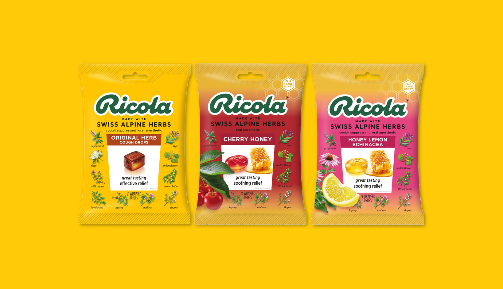
Enter Ricola, a venerable European brand renowned for its natural drops, mints, and teas. Since its inception in the early 1930s, this Swiss stalwart has captivated consumers with its sugar-free products crafted from wholesome ingredients.
If you’ve ever sought solace from a cold, chances are you’ve reached for one of Ricola’s “magic” cough drops. Their rich company history, spanning nearly a century, is a testament to their unwavering commitment to quality and innovation.

The original Ricola badge, born in 1930, avoided modification for over nine decades until 2021. This dark-green insignia, bold and unadorned, has become an icon synonymous with the brand. Its deep moss-green hue evokes the natural purity of Ricola’s offerings, while the robust script exudes warmth and reliability. Like their products, the logo exudes a sense of comfort and wholesomeness, setting it apart in a sea of generic branding.
However, in 2021, Ricola made a subtle yet discernible adjustment to their logo, introducing curved forms and slight variations in letterform thickness. While not a drastic departure, this update marks a departure from tradition, and surprisingly, not sparking conversations among design enthusiasts. Yet, amidst the flux of modernization, Ricola’s logo remains a beacon of originality and authenticity.
As a graphic designer and art director, I’ve long admired the timeless appeal of Ricola’s logo. Its even weight and distinctive style command attention, a refreshing departure from contemporary trends. While the revised logo may lack the purity of its predecessor, it still embodies the essence of the Ricola brand, a testament to its enduring legacy.
So, the next time you find yourself perusing the cold remedy aisle, take a moment to appreciate the visual harmony of Ricola’s logo (yes, even the new one). Its singularity and personality may just possess a subtle healing power of its own. After all, great design, like a soothing cough drop, has the power to comfort and uplift, even in the chilliest (like a cold…get it) of times. [Source]
Sean Fermoyle
Graphic Designer/Art Director
seanfermoyle.com