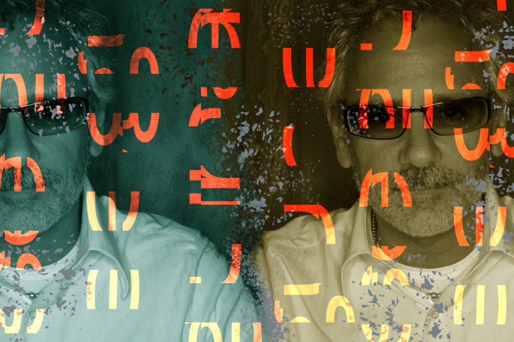
Before I knew of Carlos Segura and his work, his name always came up in conversations. He was associated with quality design, craft, and edginess. When I looked him up, one of the first things I came across was his personal branding.
The branding was simple, clean, direct, typographic, and elegant. It was unapologetic in the delivery of its message. And like most young designers, I hoped that one day I, too, could be as direct as him. It was reassuring to see an established designer with a rebellious attitude prioritizing quality work over the messiness of graphic design.
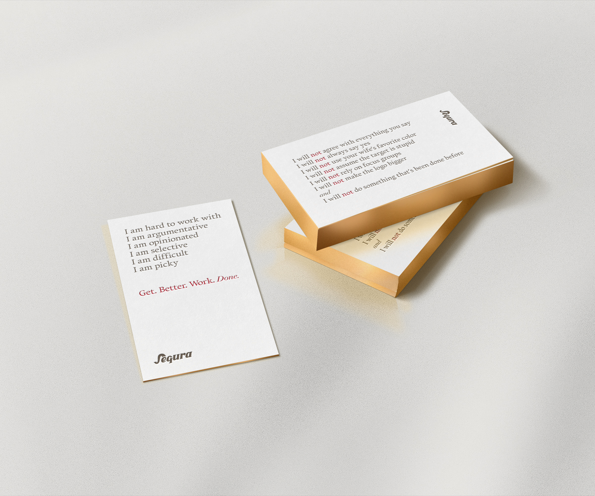
In the design industry, we are often asked to sacrifice our values, sanity, and talent for lack of satisfaction in our professions. Before it was trendy to say I will not make the logo bigger, Segura was saying it, and he was saying it boldly, not whispering it to his peers behind closed doors. Years after the launch of his brand identity, its message continues to ring true, and hopefully, it serves as inspiration for the new generation of designers who wish to do meaninful work.
The first time I reached out to Segura, he responded promptly and generously offered to speak with the Chicago Graphic Design Club. His passion for design was evident. Although it was our first time speaking, he seemed like an old friend. In his talk, he walked us through case studies and his process, while sharing stories that span his 30-plus-year career.
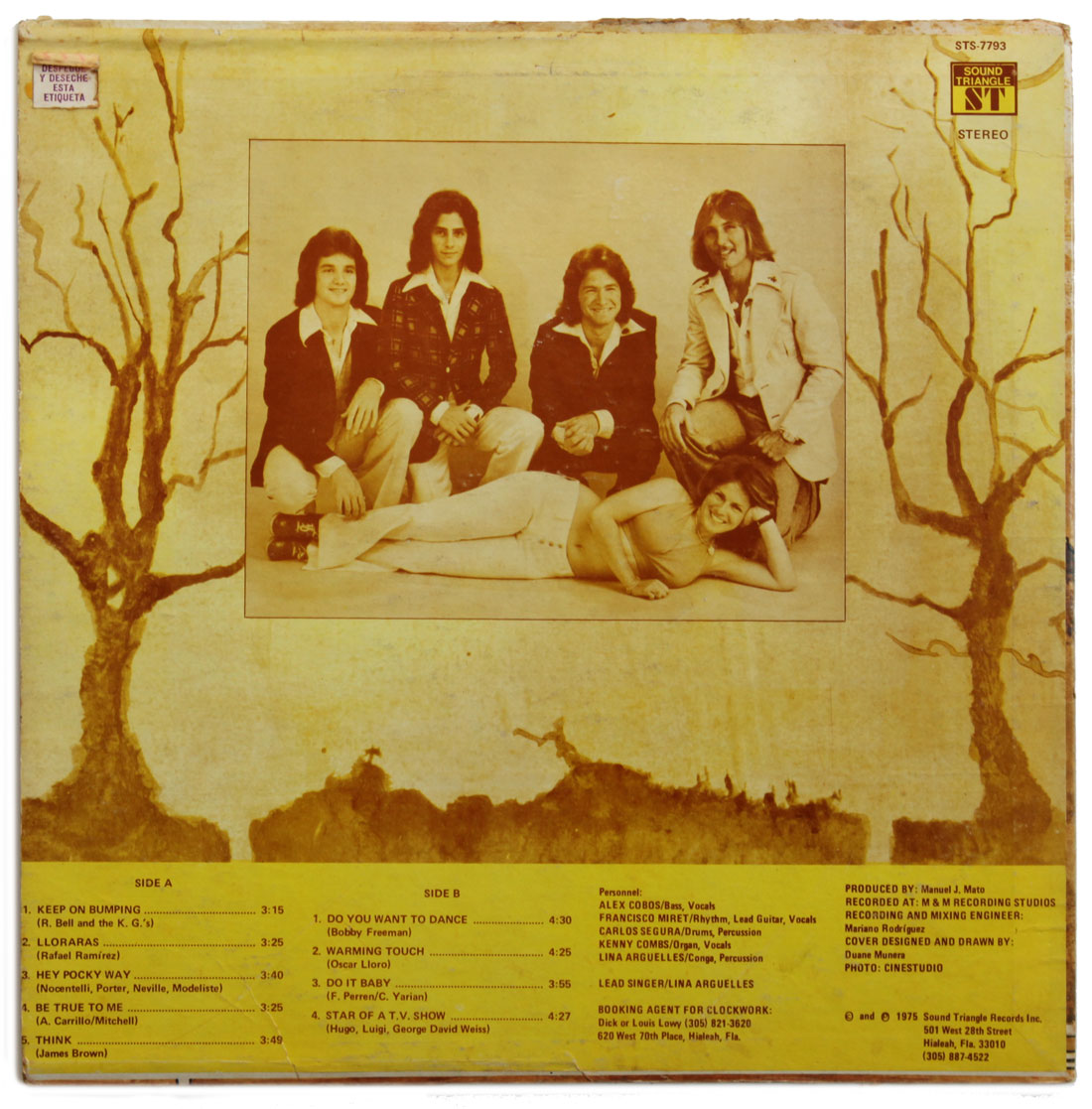
Segura came to the United States from Cuba as a young boy with his family and settled in Miami. Long before his design career, his dream was to be a drummer, which he became and by serendipity, came into contact with his true calling: graphic design. In 1975, he designed the cover of the album he drummed for, Clockwork (1975).
In Segura’s interview with Chris Do of the Futur, he mentioned designing music flyers before leaving music for graphic design. But his passion for music continues to exist through his design work — he’s designed for artists like the Smashing Pumpkins and Willie Nelson.
In 1991 he founded Segura Inc., his design studio, where he produced some of Chicago’s most prolific graphic design work. And in 1994, he founded T26, a digital type foundry that was among one of the first to license typefaces digitally online.
Today he continues to push the envelope in design. When he’s not working with clients, he assigns himself prompts that inspire him to continue generating work rooted in beauty, simplicity, and function.
He also donates his design services to non-profits and encourages other designers to do the same — to make the world a better place by supporting organizations that need quality design.
In his conversation with our podcast Underscore, he shares his approach to graphic design and his self-assigned policy of viewing the world through the lens of design.
