
Back in 2002, I dove headfirst into the wild world of digital type foundries with a crazy dream – turning one into a full-fledged design studio.
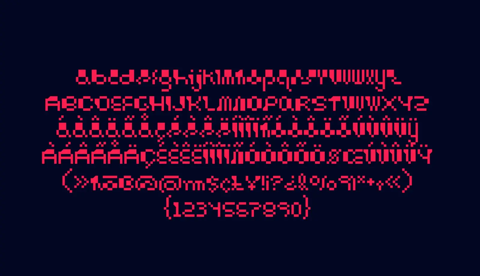
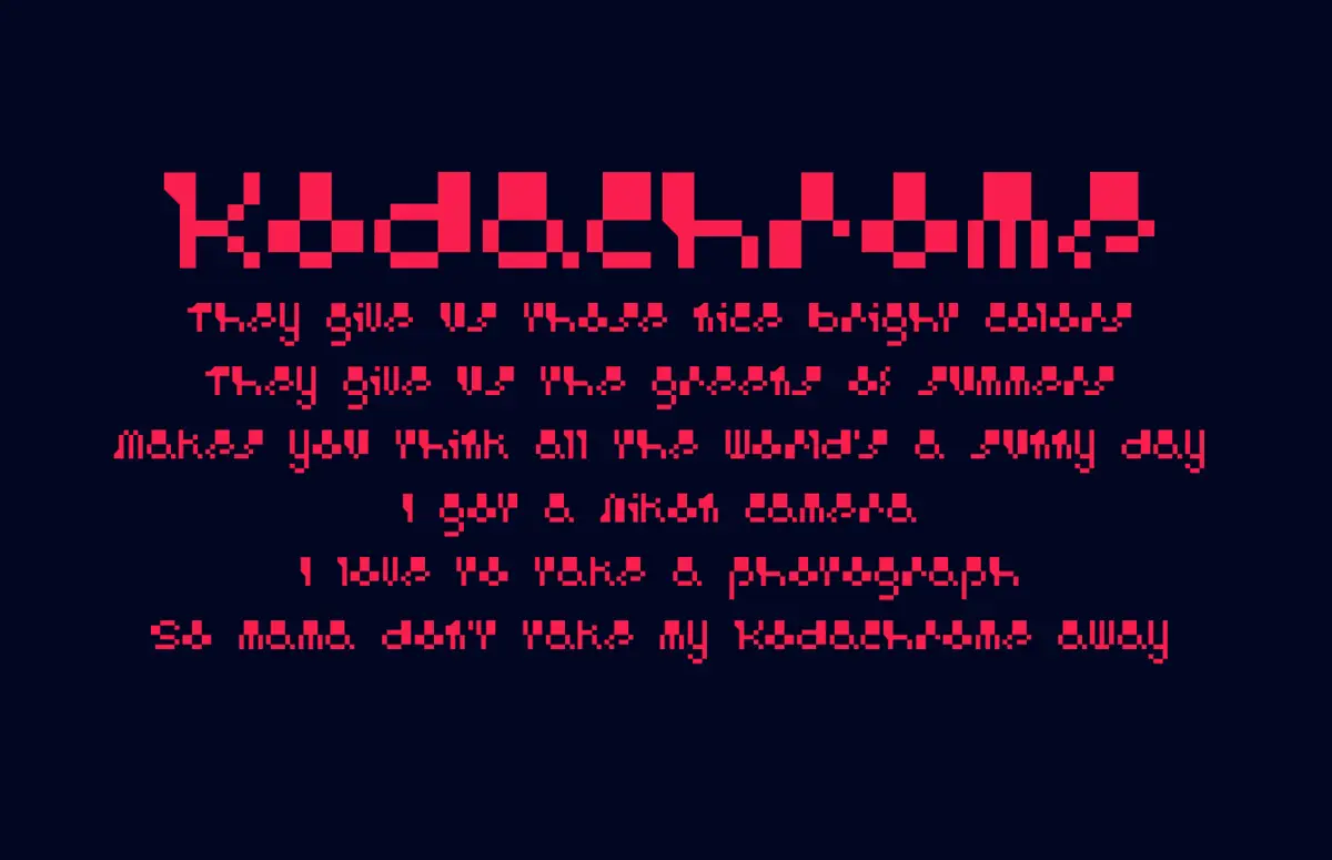
I was totally into the DIY vibe that rocked font foundries in the early ’90s, always on the lookout for fresh and captivating letter shapes. I got lucky when my photography background collided with my font quest. Pure serendipity led me to discover that the edge markings on film hid bitmap forms that looked a lot like Roman letter shapes. I got hooked on this find, spent hours dissecting these shapes, and came up with a grid system and vector production “rules” to cook up an alphabet inspired by these primal analog forms. It wasn’t a walk in the park – some letters were more legible than others. But hey, I wasn’t aiming for a font you’d use for a novel. Nope, this one was meant for captions, highlighted text, or playing around with funky typographic compositions.
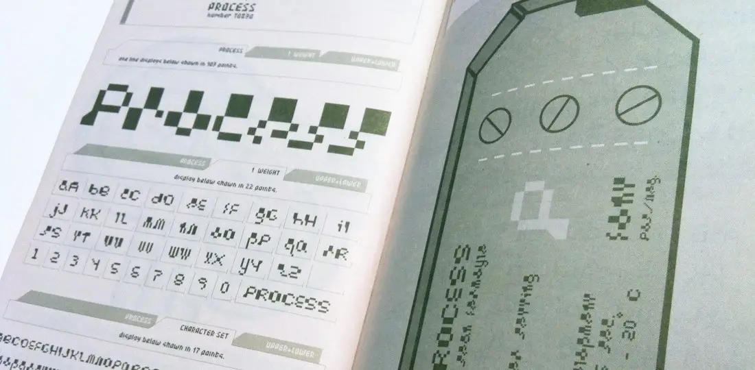
After crafting a full character set, I sent it off to the T-26 Digital Type Foundry in Chicago.
To my surprise and delight, they accepted it! And that’s how the Process font came to be. The name gives a nod to the analog film era, where film rolls underwent chemical “processing” to reveal the negatives. It’s also a subtle nod to my journey of turning letter shapes into a functional font, ready to rock in diverse graphic design projects for generations to come.
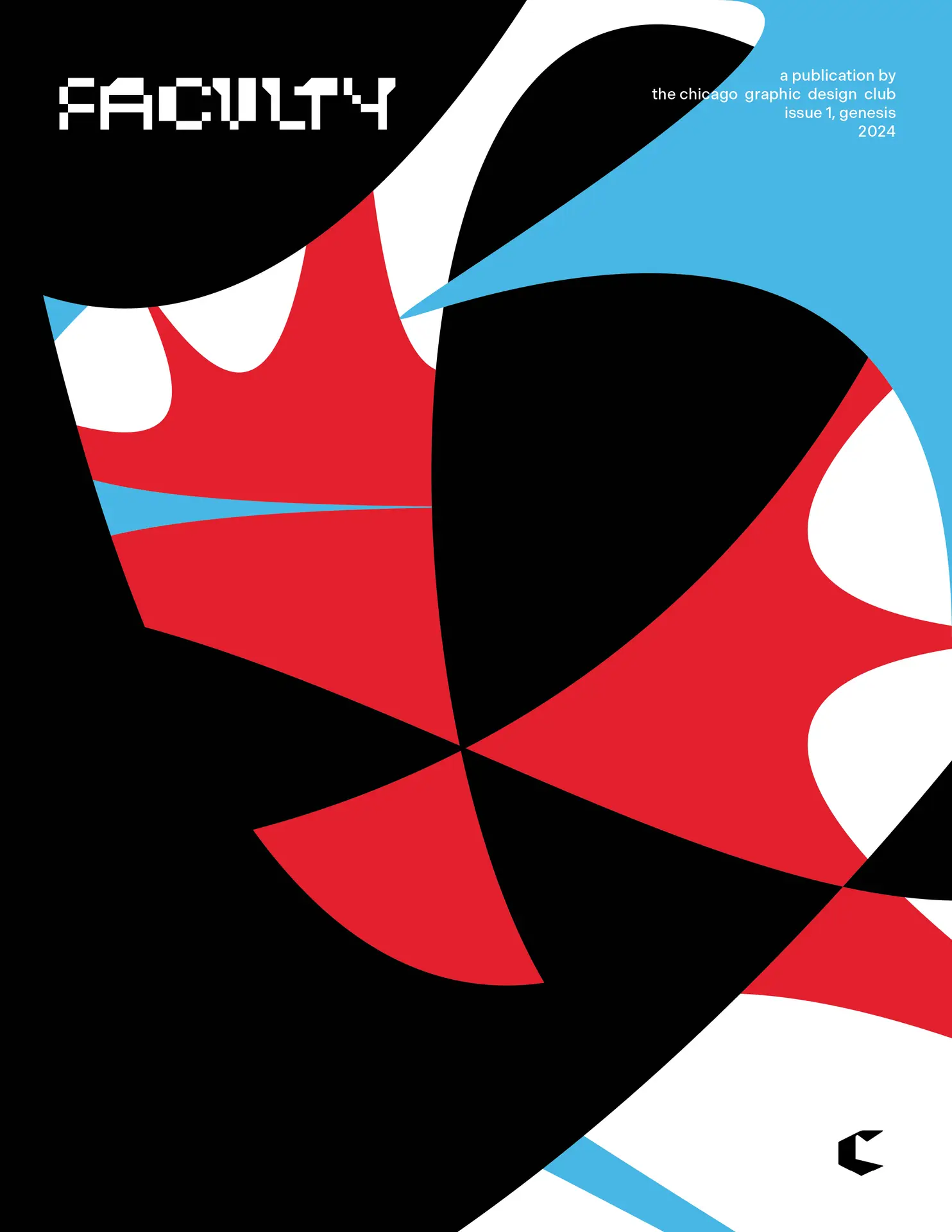
Fast forward a bunch of years, and bam! Chicago Graphic Design Club decides to use Process as their masthead in the upcoming “Faculty” publication.
BTW — You can pre-order that mag in their shop. This gives the font a second lease on life, finding a new crowd that might dig its vibe. Born from a true spirit of experimentation, fueled by an offbeat well of inspiration, tipping its hat to the good ol’ days, and embracing forward-thinking aesthetics – Process is a seriously unique batch of letters in the modern bitmap typeface game. Its journey reflects how folks keep stumbling upon it and finding cool ways to use it, making its creator (that’s me) super proud.
P.S. – In 2002 I whipped up a video for this, but it never saw the light of day. Sorry to Carlos Segura for my less-than-stellar film editing skills and for forgetting to drop his URL at the end. At the time, he was making font videos, and I just wanted to hop on that font video bandwagon!