Jackson Showalter-Cavanaugh of Okay Type, is a Chicago celebrity — one of the few type designers, that practices with rigor, and passion. I’ve gotten to know Jackson over the past few years. Issue 2 of Faculty exclusively used his typefaces, and this website also uses his fonts — you are reading this in Euchre. Most recently, Euchre was awarded TDC’s Judge’s Choice, which was described as a sans designed with text in mind.It’s a joy to read, with comfortable proportions and a dependable open structure. But Euchre’s real charm comes from its perfect balance of contrast—just enough to make words sparkle but not dazzle.
Jackson rarely does interviews, so this opportunity to hear from him, is quite special. Jackson is a treasure to Chicago’s community, so we’re honored to feature him. Jackson’s work has been featured and recognized by Communication Arts, New City, Society of Typographic Arts, Print Magazine, Type Directors Club, and How Magazine.
In 10 words or less, how would you describe yourself? Funny story. I didn’t want to answer this question because talking about myself feels awkward. Instead, I thought it would be interesting to ask ten different people for one word that describes me. Turns out that is even more uncomfortable! I gave up after asking just a couple of people. So sorry, no TLDR. Everyone will just have to keep reading.
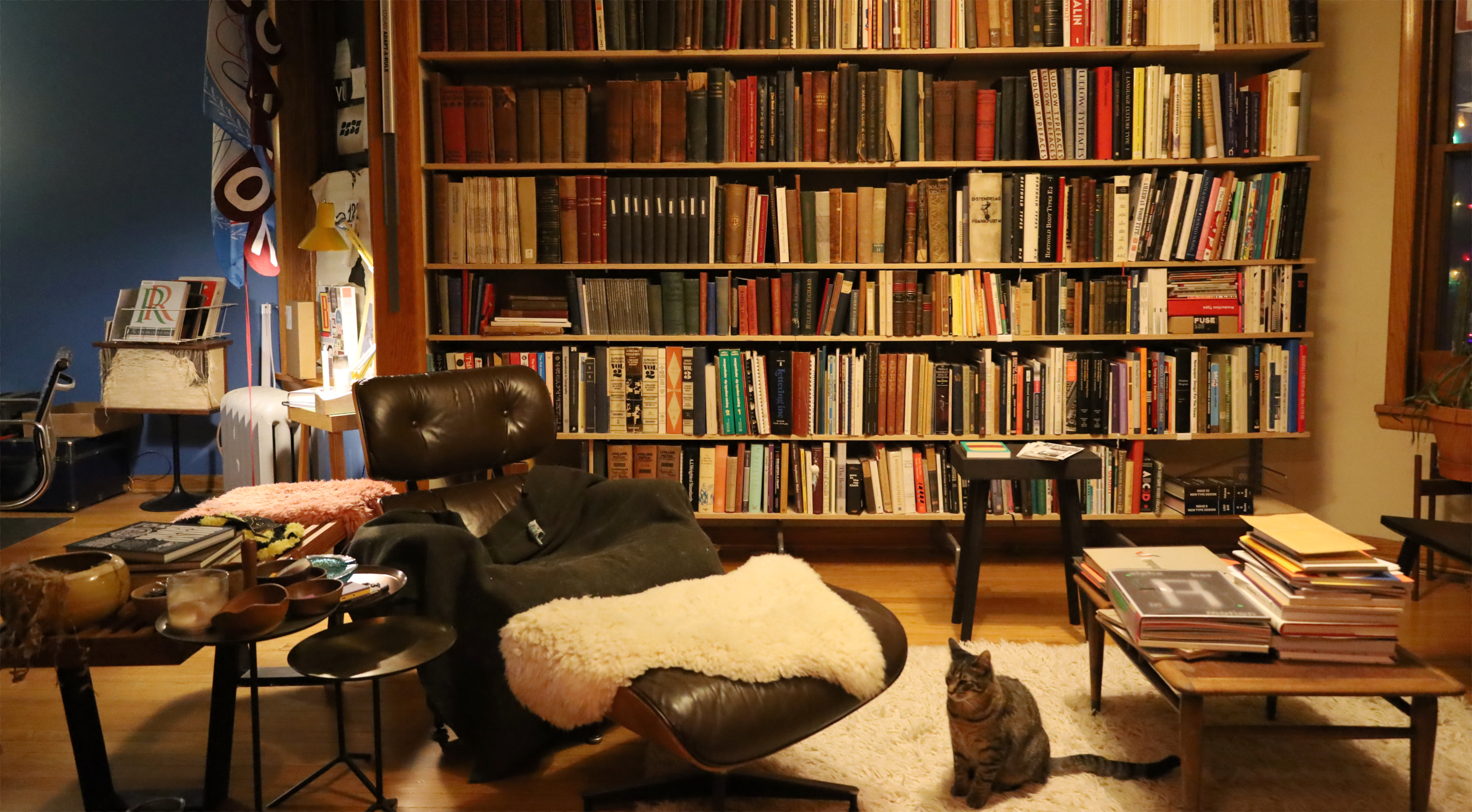
Jackson‘s home library
How did you get into design — is this an aspiration you always had? I think this happens to a lot of people: I knew I wanted to go to art school and do something arty but I couldn’t decide on a major. I didn’t really know what “graphic design” was but it sounded interesting. It also sounded practical, which felt important at the time. I didn’t want to be a starving artist. I wanted to make art that was useful. I was already doing things like making websites and album art for my friends’ bands, I just didn’t know it was a legitimate career.
If you weren’t doing design, what would you be doing?
I really enjoy creating stuff so I’d probably still be making something. I like the idea of creating things that make people happy, like pizzas. I also like the idea of making something useful, like chairs. I don’t know. I kind of already have my dream job so it’s hard to imagine doing anything else.
And then type design — why choose that over sticking with graphic design?
Once I learned that type design was an option, that people drew letters and meticulously turned them into fonts I was obsessed. My interest in doing that quickly eclipsed any other aspect of design. I was only interested in the letterforms. Where did they come from? How could I draw them? How they could they act to make a graphic design project better? Learning to see through the lens of type design and history was like discovering a secret world. Have you ever seen John Carpenter’s “They Live”? It’s kind of like that. Except instead of seeing aliens everywhere, I stare at letters.
Is there a meaning behind the name Okay Type?
Not really. One of my first projects was a Gill Kayo revival. Okay is just an anagram of Kayo. If I were to do it over again I probably should have just used my own damn name.
And what about the names of your typefaces — Euchre, Okay, Harriet, Alright…
They also don’t really mean anything either. Naming a font is really hard. I’ll come up with dozens of great names that end up being unusable for one reason or another. In the end I usually have to compromise or settle for something I don’t love as much as one of the disqualified ideas. It’s helpful to keep a long list of name ideas.
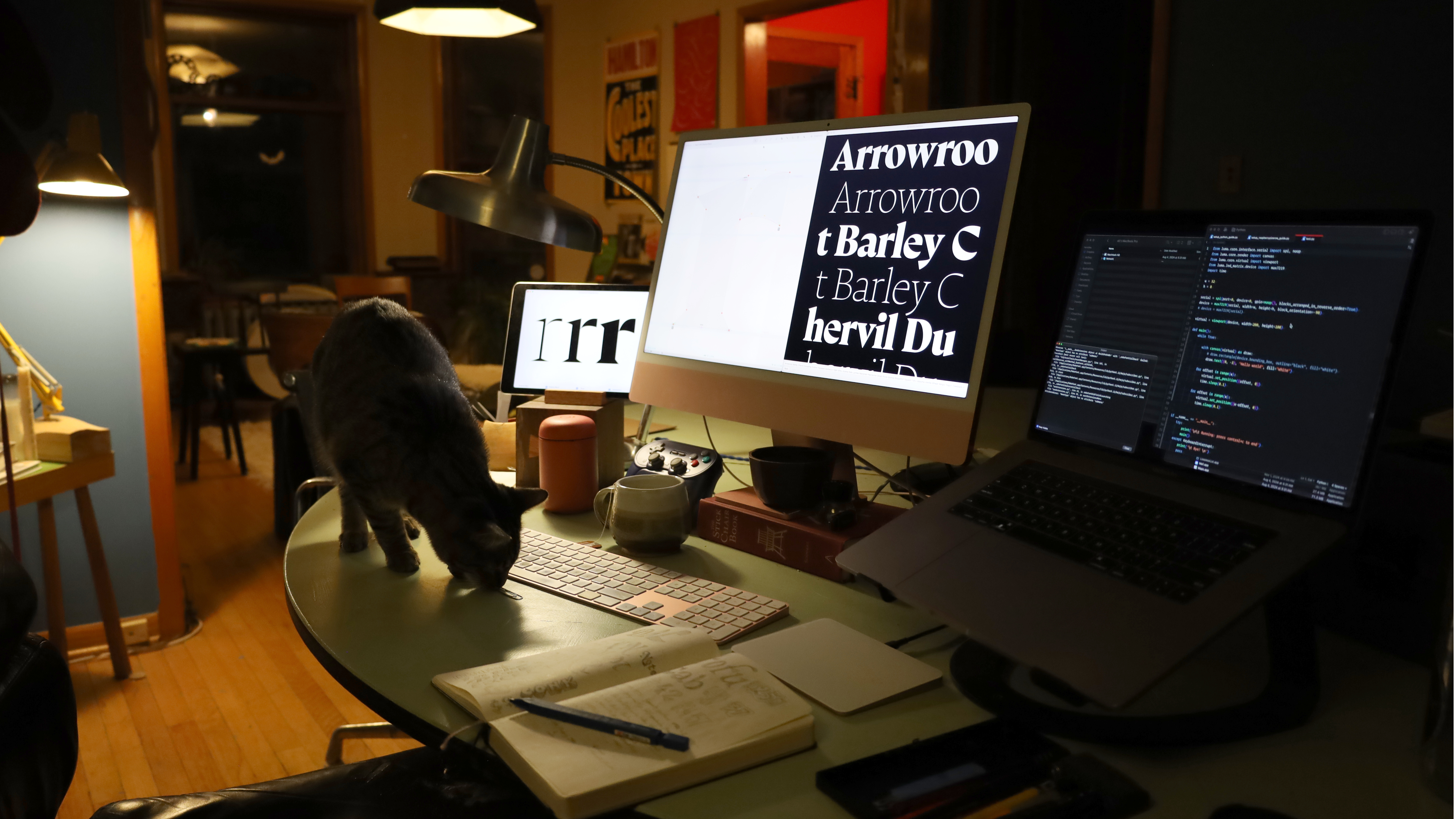
Jackson‘s Office
I have a lot of criteria for picking font names. I like to use words that already exist, I think people are more likely to remember a name if they already know the word. The name has look good in the font and showcase key letters from the design. There shouldn’t be any alliteration between the family name and style name. For technical reasons the name can’t be too long. It also shouldn’t be too short. It probably shouldn’t start with anything after “Lat” so Mac users don’t have to scroll past a hundred Lato fonts in the font menu. Et cetera.
What makes a great everyday typeface?
Design-wise, a great everyday typeface should be have the right amount of flavor to be interesting but not tiring to or gimmicky to look at. Good type design requires an interesting concept that is fundamental to the design of the letters. A recipe for creating every single glyph. In workhorse typefaces, this design system needs to be subdued. It shouldn’t be noticed by the reader but it needs to give a text a distinct atmosphere or vibe.
There are a lot of technical details too: A good workaday typeface has to set well out of the box, people don’t have time to fiddle around adjusting things. It should have a large enough character set to support common edge cases: diacritics that cover common loan words and non-American names, symbols and punctuation necessary for technical and financial texts, so on. For everyday text there should be enough weights or styles to serve multiple roles in typographic system. Often this can be two or three lists: regular, italic and bold. If you’re designing things everything you’ll probably want more styles and features. Condensed widths and display versions really helpful in extended the versatility of typeface.
It also helps to have extra details, even the nicest typefaces can get stale to a designer who has to set it over and over again. Bonus features give a bored typesetter something to get excited about. Ooh, I finally get to use that cool ☛ manicule! Oooh, this headline would look great with the fancy st ligature! Ooooh, stylistic set #02 lets me set this headline even tighter!
What drives you nuts about the typography that you see in the wild?
I already have trouble sleeping, I don’t need to get more worked up about bad type.
What are you critical and judgmental of?
Are other people not critical of everything? I’ve always been a bit of a perfectionist. Not long after starting my one real graphic design job my mom tried to warn me about being too nit-picky. She was convinced being overly critical had setback her own professional career. A week or so later I told my boss I was trying to be more positive. Without hesitation she told me, “I hired you exactly because you’re so critical.”
You’re not originally from Chicago, you’re from Detroit — what has kept you in this city?
If I stayed in Detroit after art school I almost certainly would have ended up working on big four car stuff. I absolutely hate cars. In the other hand, the Chicago graphic design scene in the early 2000s was really interesting. There were a number of big firms with high visibility clients and projects, I figured I should probably cut my teeth at a place like that. But there were also a bunch of little studios doing amazing things in addition to their day to day design practices. Let’s see what I can remember:
Under Consideration were running these great design community websites like Speak Up and Word It. I think they were also selling shirts and other physical things?
Coudal Partners had this incredible website with one of the great design feeds, Daily Signals. It also had some of the best system-font web typography ever. Coudal also ran the hugely popular Layer Tennis which featured the coolest of cool designers. They had a bunch of side hustle business. They sold fancy cd cases as Jewelboxing. They started a design-centric text-only ad network called The Deck (probably the only tasteful ad network ever). Oh, and they started Field Notes.
Threadless were making cool designer t-shirts. Rick Valicenti/Thirst had been running a side hustle type foundry called Thirstype. Segura was also running a type foundry and another side business selling their own blank cd cases.
What are your thoughts on artificial intelligence’s role in design and specifically, type design?
Why are the people pushing hardest for AI also the worst humans on the planet? White supremacist billionaire tech bros. Fuck AI.
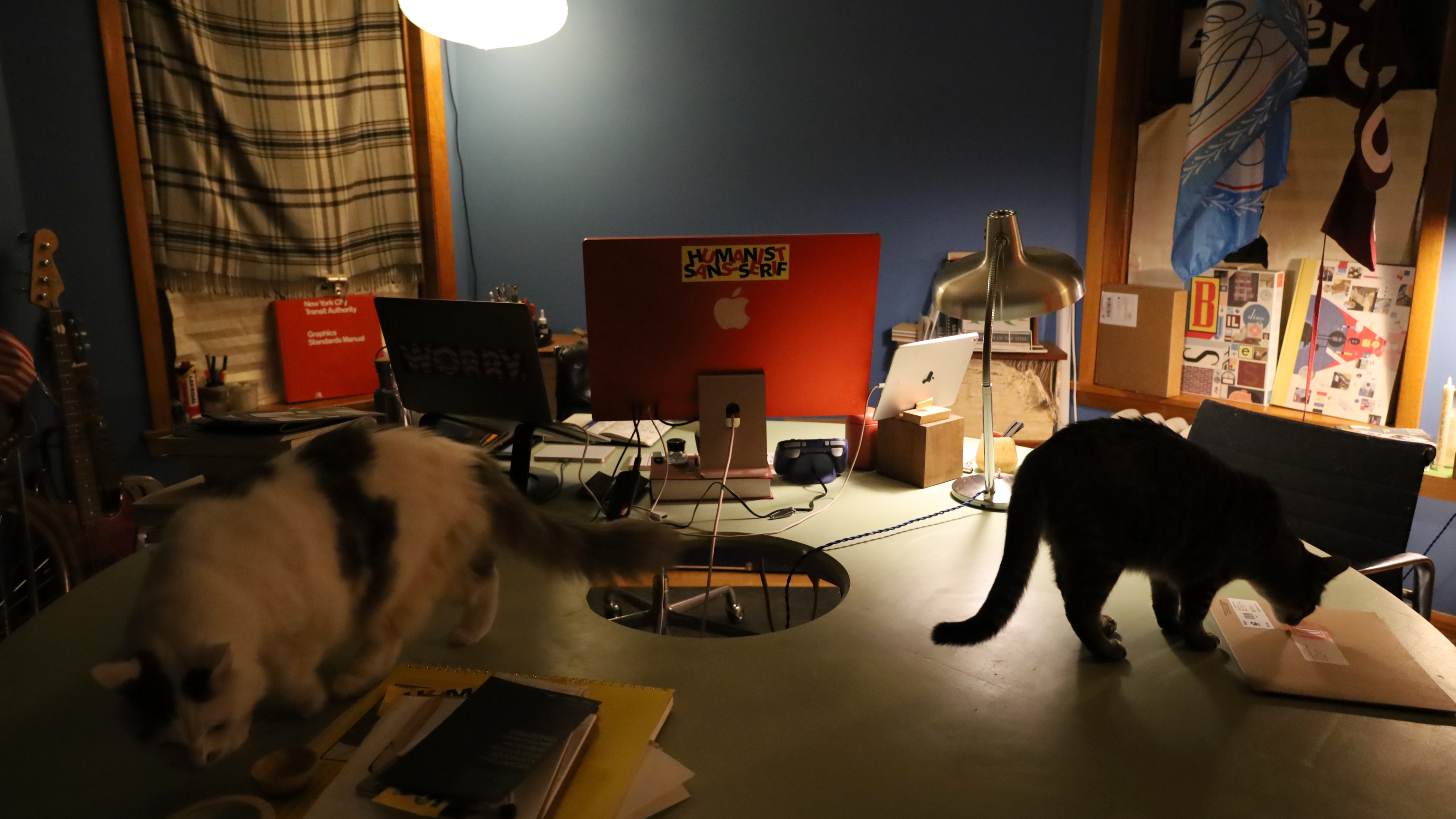
Jackson‘s Office with Cats
You’ve chosen to keep Okay Type independent — your fonts are not available through any of the big distributors — why?
I’ve tried it. It didn’t go well.
On paper, third-party font resellers can be great. I’m not good at promoting my fonts, they can be. I don’t have a big library and struggle to reach new customers, they have huge libraries and offer lots of opportunities to discover new fonts. The relationship can work really well when both sides see each other as partners.
In reality, font resellers stopped treating type designers as partners over a decade ago. They used to be small independent companies, usually run by a handful of techie type nerds. Now they’re all publicly traded or venture capital -owned. They treat fonts as a commodity. They use their market share to strong arm foundries into increasingly worse (and dependent) distribution agreements. Inquiries for custom licenses and work used to be referred back to foundries, now resellers keep those deals to themselves and pay meager royalties. What was once a mutually beneficial and sustainable relationship is now more like outsourcing.
Recently they’ve increased their belligerence by targeting their own customers. The internet is rife with designers being harassed by sketchy license enforcement bots. Even worse are the army of “sales reps” attempting to trick or scare legitimate font license holding businesses into exploitatively high-price subscription licenses.
Ugh. It’s crazy to me anyone would sell fonts through or buy fonts from these companies. Ugh. I need a break. [shuts off computer]
…
What do you have to say to aspiring type designers who want to create their first font?
Go for it. Maybe you’ll have fun. At the very least, you’ll learn something.
How can they get started?
Just start drawing letters.
If you enjoy it, keep going. Draw letters. Learn calligraphy. Draw more letters. Study type history. Draw more. Start asking questions. Keep drawing. Ask more questions. Draw more letters. Repeat.
What is keeping you inspired?
I still deeply enjoy making letters. I love the feeling when a project starts to come together, when the font starts to look like a real thing. That’s the best.
I know you’re into vinyl, hockey, and books — tell us about this
I love hockey. I also love biking. I collect type books. I make a lot of pizza. I don’t know. Sorry, I’m still trying to recover from the back to back AI and font distributor questions.
What are your office essentials?
I just need a computer and a sketchbook. I have a lot of things that make working easier and/or less boring, but they’re definitely not essential.
 I’ve always been a bit of a perfectionist. Not long after starting my one real graphic design job my mom tried to warn me about being too nit-picky. She was convinced being overly critical had setback her own professional career. A week or so later I told my boss I was trying to be more positive. Without hesitation she told me, “I hired you exactly because you’re so critical.”